Trust the Magic of New Beginnings

Growing up, I was always fascinated by the flashing numbers and glowing charts of Wall Street. But it wasn’t the thrill of trading or the chaos of the stock exchange that captivated me but the dashboards. Those dynamic displays told stories, transforming complex data points into a cohesive narrative. I found myself wondering: How do these systems work? How do they take raw, chaotic numbers and turn them into insights that drive decisions?

After completing my bachelor’s degree in Electrical and Computer Engineering, I stood at a fork in the road. I had two choices: stay in the engineering path I was already familiar with, or venture into the unknown world of Business Analytics and Data Science. The engineering route was straightforward as it was what I had studied, and it felt safe. But I asked myself: Do I want to do engineering work for the rest of my life? That question lingered, and the allure of the unknown grew stronger.

What drew me to the field of data wasn’t just the programming or the math, though those are undeniably important. It was the multidisciplinary nature of the work. Being a BI Analyst wasn’t just about building models or coding scripts; it required me to bridge gaps. I had to connect with customers, interpret their needs, and turn raw, unstructured data into actionable insights. It was about understanding not just the data, but also the people behind it: stakeholders and decision-makers. I realised that Data Science was as much an art of understanding humans as it was a science of understanding numbers.

My first opportunity in this field came at Europcar, where I transitioned from theory to practice. Suddenly, I wasn’t just observing dashboard but building them. I created solutions that drove decisions across Engineering, Finance, and even Supply Chain Management. Each dashboard wasn’t just a tool but a window into the business, helping teams uncover insights and take meaningful action. Whether it was optimizing operations for engineering teams, providing financial clarity to executives, or streamlining supply chain processes, I saw the tangible impact of my work.

Today, I remain deeply passionate about bridging the gap between data and decision-making. Below, you’ll find a collection of projects that reflect my journey—a journey fueled by curiosity, guided by creativity, and driven by a desire to make data not just understandable, but impactful.

Building Data Castles with dbt

Why Staging Layers Are the Scaffolding of Every Great Pipeline

It all started with a real-world problem: a customer drowning in messy PostgreSQL tables—NULL values lurking like potholes, duplicate records multiplying like rabbits, and business teams begging for clean data. But when it came time to share the solution with the world, I needed something lighter, faster, and portable. Enter DuckDB, the plucky little database that could. Unlike its heavyweight cousins, DuckDB runs locally with zero setup—no servers, no cloud costs, just pure analytical power on your laptop. Perfect for showing off pipeline magic without the infrastructure headaches.

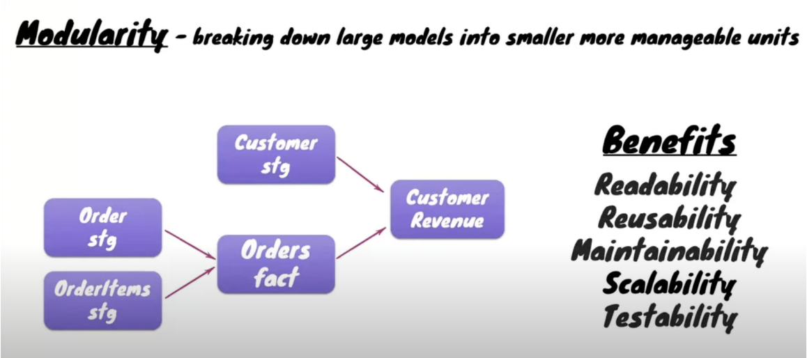
The Blueprint: A Three-Story Data House

I built a medallion architecture. A data neighborhood where information grows wiser as it climbs from floor to floor.

Modular Structure

The Basement (Raw Layer)

Here, data arrives exactly as it's born: unfiltered, unapologetic, and occasionally chaotic. We kept it untouched, like a time capsule, because you never know when you'll need to revisit the original recipe.

The Ground Floor (Staging Views)

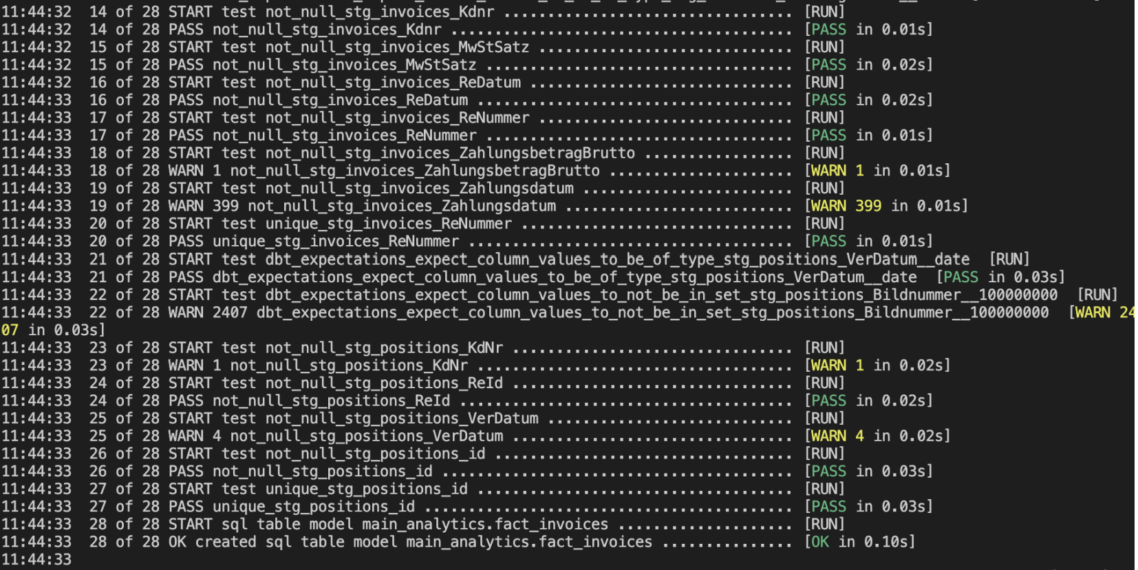
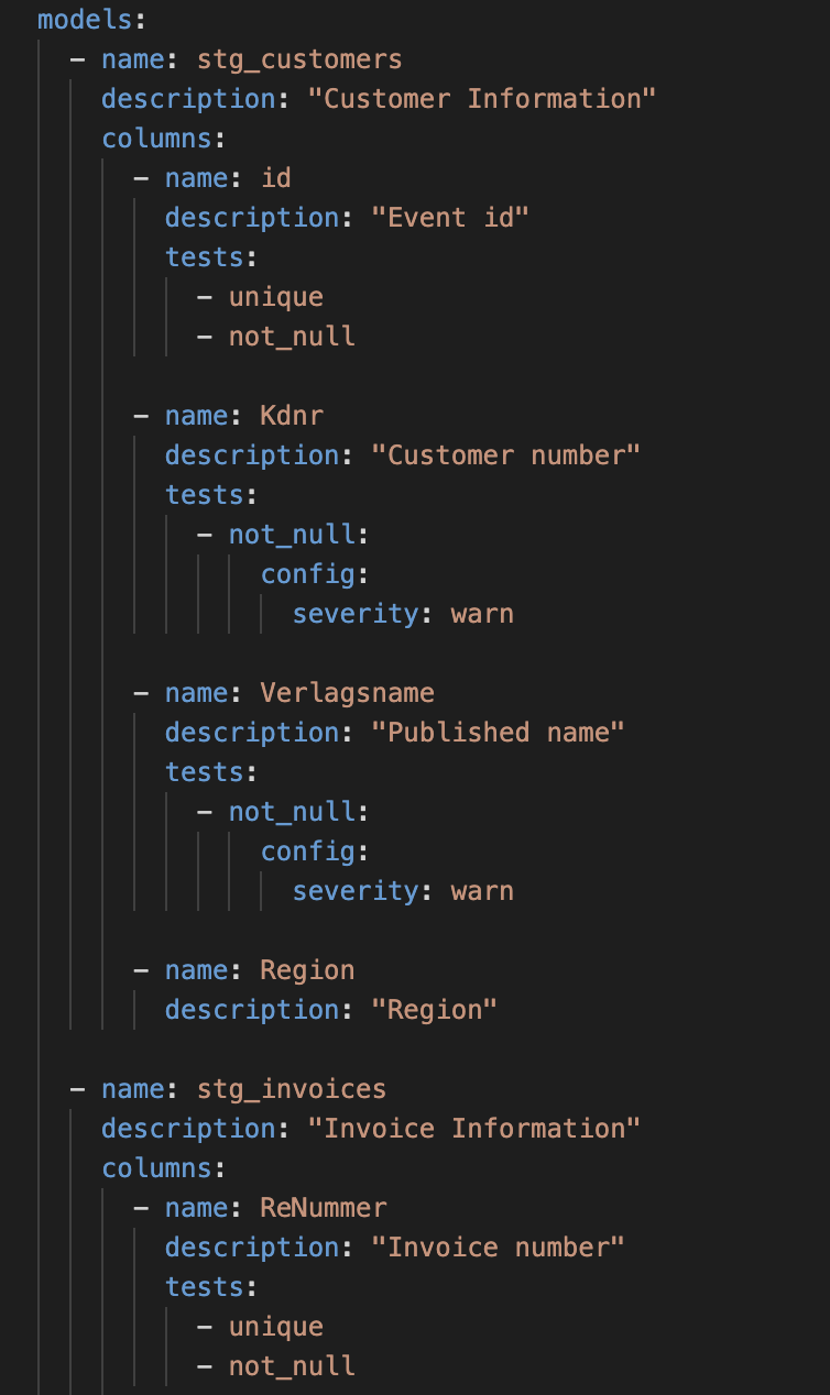
This is where the scrubbing bubbles came out. Using dbt, I crafted lightweight views (not tables!) to clean data on-the-fly: standardizing NULLs, fixing typos, and adding unit tests (hidden in schema.yml like secret quality-control traps). Views meant no storage and transformed data every time someone peeked in.

DBT Tests

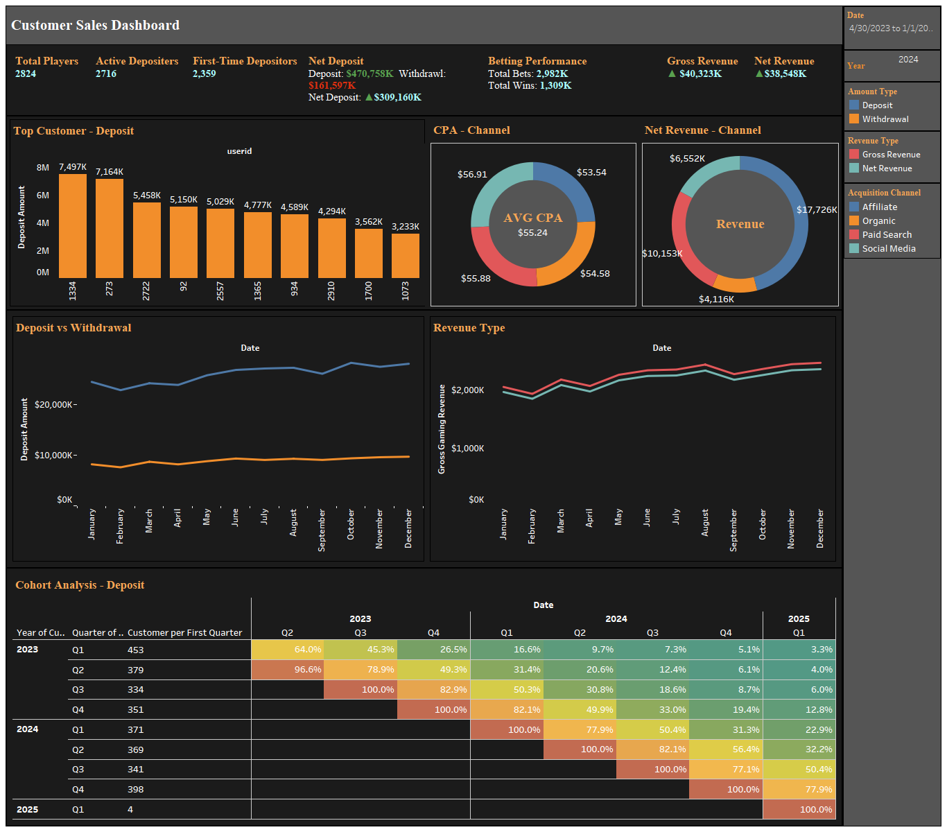
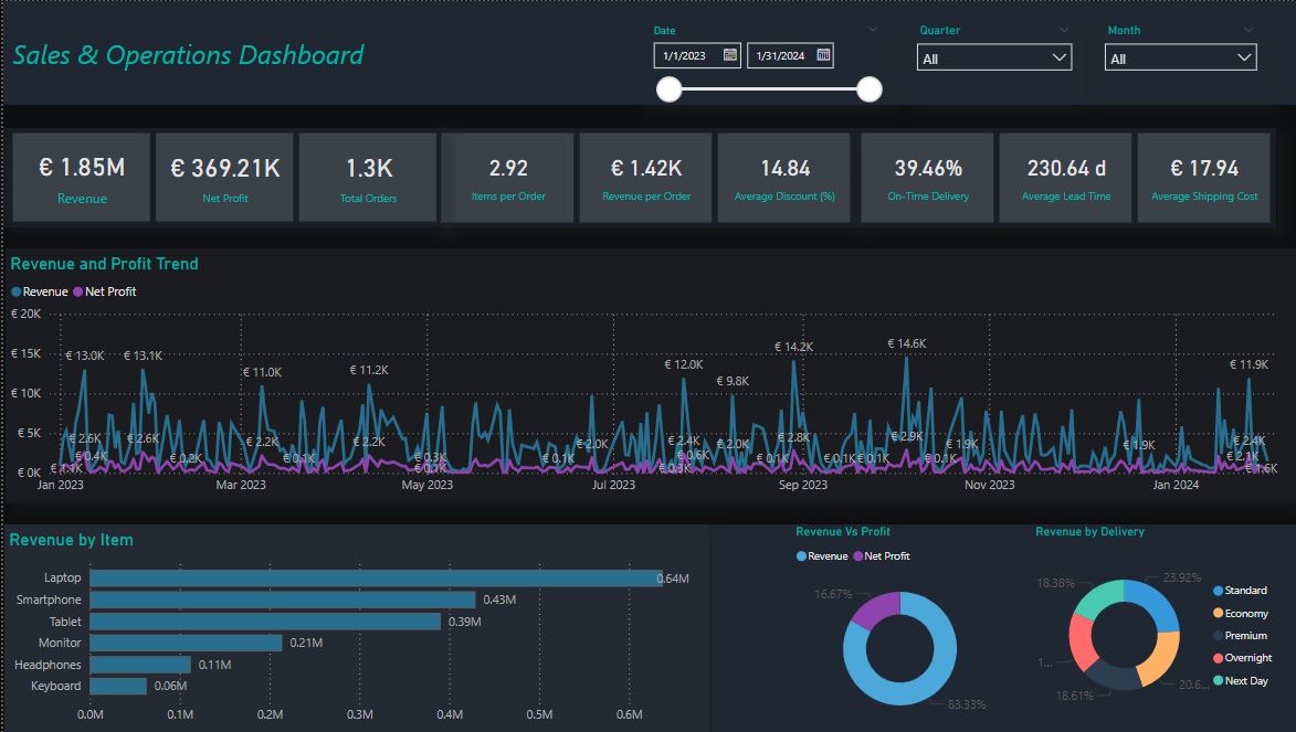
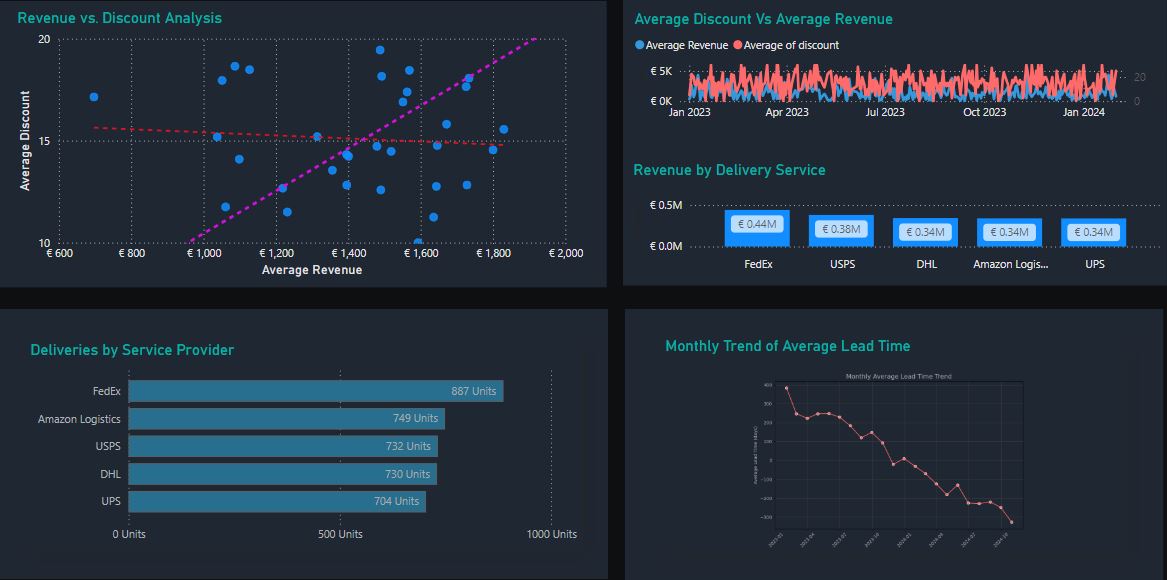
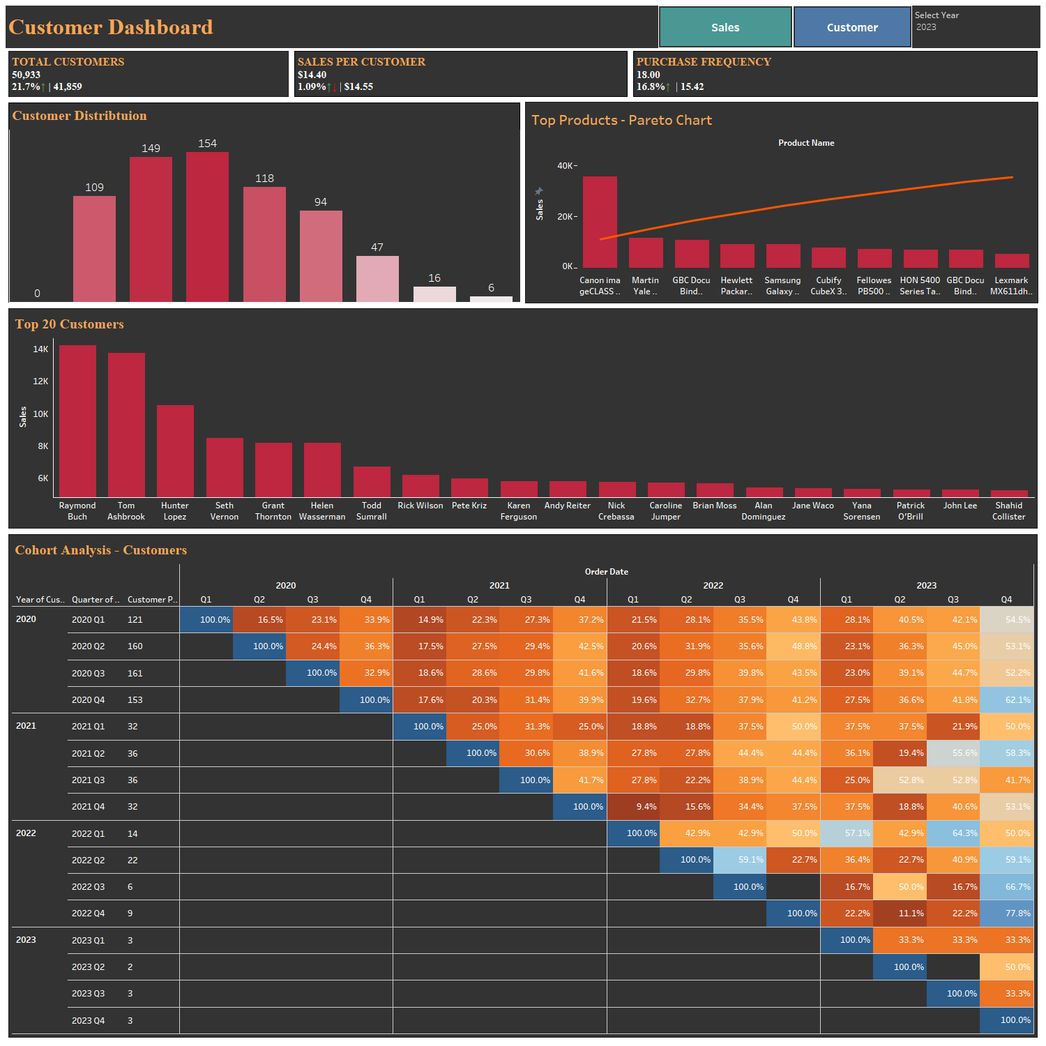
The Penthouse (Datamart Tables)

For the business teams who just wanted answers (not SQL lessons). I served up dimension tables (clean, descriptive reference data) and fact tables (the measurable "actions" like sales or invoices). These golden datasets were pre-joined, pre-aggregated, and ready for drag-and-drop dashboarding. Even better? They became building blocks for future datamarts (like LEGO pieces for data teams).

DBT Build

Extract, Transform, and Pray

Because Nothing Says Adventure Like Debugging at Midnight

Picture this: A pile of Excel files containing fragmented data about demand planning. Forecasts, stock levels, and revenue numbers—all sitting in silos, waiting to be transformed into meaningful insights. We had a mission: to turn this chaos into clarity. Enter Airflow, our trusty orchestrator in this adventure.

The journey began with extracting data from these Excel files. Every day, a new file would drop into our system. Using Airflow’s DAGs (Directed Acyclic Graphs), we automated the process of fetching these files and ensuring they were ready for transformation. It wasn’t just about fetching the data; it was about making sure no piece went missing.

ETL Pipeline
View ETL Scripts

Raw data is like raw ingredients; it needs preparation to shine. We wrote custom Python scripts to perform the transformations: renaming columns, calculating profit margins, and predicting reorder levels. Using Airflow, we scheduled these transformations so they happened seamlessly every single day. It wasn’t always smooth sailing, as debugging errors became a daily ritual, but seeing clean, structured data emerge was worth every line of code. Once transformed, the data was loaded into our PostgreSQL database.

Once the data was transformed and safely housed in our PostgreSQL database, it was time to bring it to life. Enter Power BI, the canvas where raw numbers and metrics transformed into a masterpiece of actionable insights. The goal? To create a dashboard that wasn’t just functional but intuitive. The dashboard became the heartbeat of demand planning. It provided an interactive interface where stakeholders could explore key metrics like forecast accuracy, stock availability, reorder levels, and profit margins. Every graph, every filter, and every visualization was designed to make the data not only accessible but actionable.

Demand Planning Dashboard
View Interactive Dashboard

The Data Assembly Line

Transforming Chaos into Order with Python, Airflow, and BigQuery

Sometimes, the real magic lies not in visualizing data but in building the invisible pathways that make the data accessible. In this project, we tackled the challenge of merging disparate datasets: transactions, user profiles, and preferences.The journey was about creating a seamless flow of data, using Airflow as the architect of this orchestration.

At the heart of it all was the extraction process, where multiple Excel files containing transaction logs and user details were ingested daily. With Airflow DAGs, we automated this operation to ensure that no file was ever left behind. Each piece of raw data was carefully fetched, validated, and handed over to the next stage of its transformation.

With the data extracted, the real work began. Using Python, we transformed the data—renaming columns, cleaning unnecessary fields, and merging tables to create a unified structure. Transactions were enriched with user details and preferences, making it easier to analyze behavioral patterns in future use cases. This transformation wasn’t just about cleaning; it was about creating relationships between datasets, turning numbers and text into a story of user engagement.

Once transformed, the data was loaded into a BigQuery table. This repository served as a scalable and high-performance solution for storing the newly structured data. Every row and column in the final table was a testament to the precision and effort of the pipeline. BigQuery wasn’t just the destination; it was the starting point for future analytics and data-driven decision-making.

Big Query Pipeline Airflow

View ETL Script

Profit Patterns Unlocked

Insights into Customer Behavior and Financial Growth

This Customer Sales Dashboard offers a powerful, data-driven overview of key player engagement and financial metrics. It provides a comprehensive understanding of deposit trends, revenue streams, and player behavior over time. The dashboard is designed to empower stakeholders with actionable insights for strategic decision-making.

Key metrics include Total Players, Active Depositors, Net Deposit, Gross Revenue, and Net Revenue, complemented by detailed visualizations that reveal top customers, channel-specific performance, and financial trends.

360° Business Performance: A Sales & Operations Dashboard

From Financials to Fulfillment—A Dashboard Built for Strategic Impact

This comprehensive Sales and Operations Dashboard provides an integrated view of key business metrics.

Key Metrics and Insights

The dashboard offers a high-level overview of key metrics, including Revenue, Net Profit, Total Orders, Items per Order, Average Discount, and On-Time Delivery Percentage. These metrics are complemented by detailed visualizations, enabling users to track performance and uncover patterns across various dimensions.

Revenue and Profitability

The integrated Revenue and Profit Trend chart highlights financial performance over time, providing insights into profitability and revenue generation. Visualizations like Revenue vs. Discount Analysis and Average Discount vs. Average Revenue help stakeholders understand the impact of discounts on overall revenue, aiding in strategic pricing and discounting decisions.

Operational Efficiency

Logistics and operational performance metrics, such as Average Lead Time and Average Shipping Cost, are visualized alongside trends like Monthly Lead Time. The Deliveries by Service Provider bar chart offers insights into shipment distribution, enabling teams to assess the efficiency of different service providers and optimize supply chain processes.

Product-Level Insights

The Revenue by Item bar chart provides a granular view of product contributions, allowing users to identify top-performing items and areas of potential growth. Combined with other metrics, this chart helps businesses align their product strategies with revenue goals.

By consolidating all key insights into one page, this unified dashboard empowers stakeholders to make informed decisions efficiently, driving business growth and operational excellence.

Customer Cohort Dashboard

Decoding Trends in Retention, Sales Performance, and Top Products

This Customer Dashboard provides a comprehensive view of customer distribution, sales performance, and retention trends. It highlights key metrics like Total Customers, Sales per Customer, and Purchase Frequency, offering actionable insights into customer behavior and engagement patterns.

The dashboard includes detailed breakdowns of Customer Distribution, Top Customers, and Top Products using bar charts and Pareto analysis. It allows stakeholders to identify high-value customers and best-performing products, helping optimize marketing and sales strategies.

A key feature of this dashboard is the Cohort Analysis Table, which uncovers customer retention trends across quarters and years. This analysis helps businesses understand customer loyalty and identify patterns in purchasing behavior over time.

Sales Insights Simplified: A Dashboard for Tracking Performance and Growth.

Transforming Data into Strategic Insights with Time Series and Cohort Analysis

This Sales Performance Dashboard was designed to provide a powerful, data-driven view of critical business metrics. Built with time series and cohort analysis, it empowers users to explore key performance indicators (KPIs) like revenue, cost, profit, and marketing spend over time. Each KPI can be filtered by date, department, product, and region, allowing teams to focus on specific aspects of performance with ease.

Key features include a dynamic time series visualization that tracks revenue, cost, and profit trends, as well as a cohort analysis table to understand customer purchasing patterns over time. The dashboard also provides insights into revenue by region and customer type, giving a comprehensive view of the market landscape. Designed for stakeholders across various departments, this tool facilitates strategic decisions with accurate, actionable insights.

Sales Performance Dashboard

View Interactive Dashboard

Marketing Metrics Unleashed: A Dashboard for Real-Time Campaign Analysis

Turning Ad Spend into Actionable Insights Across All Channels

This Marketing Analytics Dashboard provides a powerful, intuitive overview of essential marketing KPIs, allowing for a comprehensive analysis of campaign performance across multiple channels. Designed with flexibility in mind, the dashboard offers filtering options by date, quarter, month, and channel, ensuring stakeholders can explore data at any desired granularity.

Key metrics, such as Current Revenue, Marketing Spend, CPC (Cost Per Click), ROAS (Return on Ad Spend), and LCR (Lead Conversion Rate), are displayed in interactive cards. Each card dynamically compares the selected period to the previous one—whether it’s two weeks, four months, or any custom range—offering immediate insight into period-over-period performance.

This dashboard also includes time series charts that break down revenue versus marketing spend for each advertising channel, enabling a clear view of spend effectiveness over time. Additionally, visualizations of Revenue by Channel and Visitor & Purchasing Visitors by Channel provide a quick comparison of channel performance, highlighting where efforts are most impactful.

Marketing Analytics Dashboard

View Interactive Dashboard

Coming Soon: Dashboards & Data Pipelines in Progress 🔧

Work in progress! I’ve been crafting more data pipeline and dashboard projects behind the scenes. Check back soon to explore new projects that turn raw data into actionable insights!

Work in Progress